

Suppose you think about how much we’ve changed the way of using different platforms and how much the other devices have been changed to be adapted to our requirements. In that case, it’s no surprise that the transformations brought us into a new multi-screen world where we had to rethink how to access the internet from different devices with different sizes and layouts. Due to these changes when designing a site, it’s essential to consider its optimization to allow the display on multiple platforms: desktops, tablets, smartphones or smart TV.
In 2012 Google released a study about how we use multiple screens to navigate the web and often perform activities across mobile, tablet and desktop. The essential conclusion of this study is that smartphones are the most used devices throughout the day. Usually, they are used as the most common starting point for activities across multiple screens. For more information, click on the following link.
It’s no wonder that, following this study, Google has decided to consider this new way of using mobile. So naturally, they are moving towards making the mobile search engine experience more relevant to users’ needs. To provide a better mobile-friendliness ranking, Google has decided to adapt their algorithms; on April 21st 2015, a new algorithm update was rolled out, which led to prioritizing mobile-friendly websites. This means that if your website is not mobile-friendly, you are potentially looking at losing traffic, and you won’t rank as highly in the mobile search results.
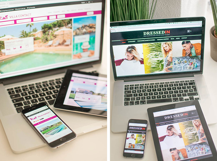
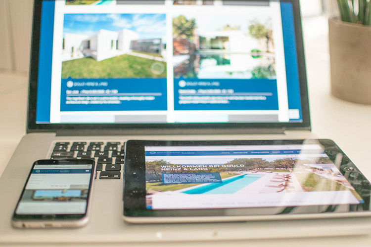
Mobile and tablet usage will continue to rise. Therefore, Google will prioritise websites that work correctly on these devices to provide a better mobile experience for searchers and give people exactly what they want. Inmedia Design can help you stay up-to-date and create or improve a responsive web design to provide the best user experience possible. We eliminate the need to have and manage separate sites and develop or implement your website to be adapted automatically to whatever size screen and layout it’s displayed on.
What are the advantages?
1. Flexible, responsive web design sites are automatically adaptable, meaning the content moves depending on the screen resolutions and the type of devices.
2. Enhance the user experience; it’s crucial that when your site is accessed via smartphones or tablets, the user experience runs smoother. Small text that the user has to continually zoom to read or incorrect pages cause distress, and the user will leave your page very quickly. With a responsive web design, you provide the optimal user experience irrespective of the device the user uses to view your website. Thanks to a versatile display, site elements, such as navigation tools, social sharing buttons, or images and text, will be re-sized and re-ordered automatically to provide smoother navigation and better usability.
3. Cost-effective, a responsive design means one site can be implemented across devices, which means fewer costs than having multiple separate websites.
4. Elementary to manage; having one site is far easier than working in two areas. For example, when making changes to your site, you only have to make those changes in one place instead of two. Furthermore, if you have separate areas, you will have to manage various SEO campaigns, and it’s far easier to handle SEO campaigns in one place instead of two separate ones.
All businesses should look at implementing a mobile-friendly website. It’s what users expect. Here at InMedia Design, when creating a new site or implementing your existing one, we ensure that responsive design isis at the forefront of the service we provide.
Our response.
A cutting-edge responsive web design made by INMEDIA.

