When we design a website, we create the overall layout, which is the primary focus of the design. Our attention is usually drawn to the visual aesthetics of the site; however, there can be tiny details, so small they are usually less perceived. These details can make the difference between user-friendly and complicated websites.
Here’s where micro-interactions come into play – they make the website more appealing, enhance the user experience and make the overall navigation easier.
Micro-interactions are such a fundamental part of website design these days. They usually come in the form of small elements that add movements, create surprise and can guide the users throughout the website in an easy, fun and effective way.
Let’s look into the specifics of micro-interactions and how they can be used.
1 – Display system status
Remember that it’s important to keep your user informed about what’s happening. Users expect to get responses immediately, but there are situations when a site needs some time before an action is completed. So, the interface should keep the user aware of what is happening.
Tips: Show the progress in the status by displaying a graphic in the background, measuring bitrate, or playing a sound.

2 – Highlight important parts
Many designers believe that to save space, it’s good practice to make things smaller without thinking that the user might not see it.
Tips: use animation to attract a user’s attention to important details so that they are not overlooked.

3 – Guide the user
With responsive websites, it’s important to consider that the information should be adapted to fit the device. In the era of smartphones and devices with small screens, it can be difficult to fit a lot of information on one screen.
Tips: use motion to transport users between pages smoothly – keep clear navigation between different pages so the user understands what appeared from where.

4 – Facilitate the whole experience
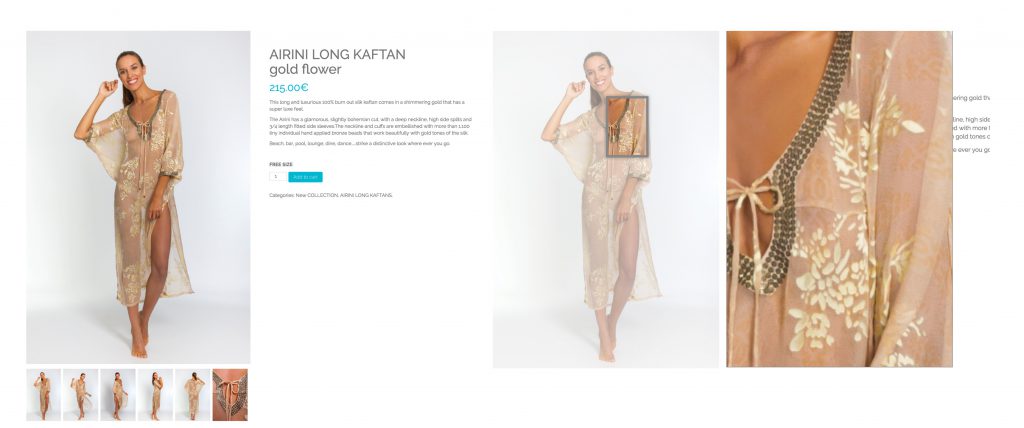
Micro-interactions should make the whole experience easier and more fun. So it’s important to keep it familiar, Aquamarine’s intuitive cursor and hover to close-up are classic eCommerce features put to great use.
Tips: use micro-interactions in a smart way and keep it simple, so the users feel familiar with it.


 Deutsch
 Español


